
What do the best gym and fitness websites look like?
And how are the most profitable gyms, fitness centers, franchises, CrossFit affiliates and boutiques creating attractive sites that engage and win over new clients?
We’ll tell you below in this definitive guide to web design in the fitness industry.
We’ll lay out all the things you have to have, including essential above-the-fold elements many people omit, appointment booking systems, secondary calls to action, lead-capture systems, social proof and testimonials, feature media, service presentation, and much more.
If your current web design is raging tire fire that sends people scrambling to click the back button, read on to find out about the websites used by the most profitable gyms in the fitness industry.
Gym Websites: Out With the Old
First, a few dated dinosaurs of design that need to die. If you’ve got this stuff on your gym website right now, it’s time for an overhaul.
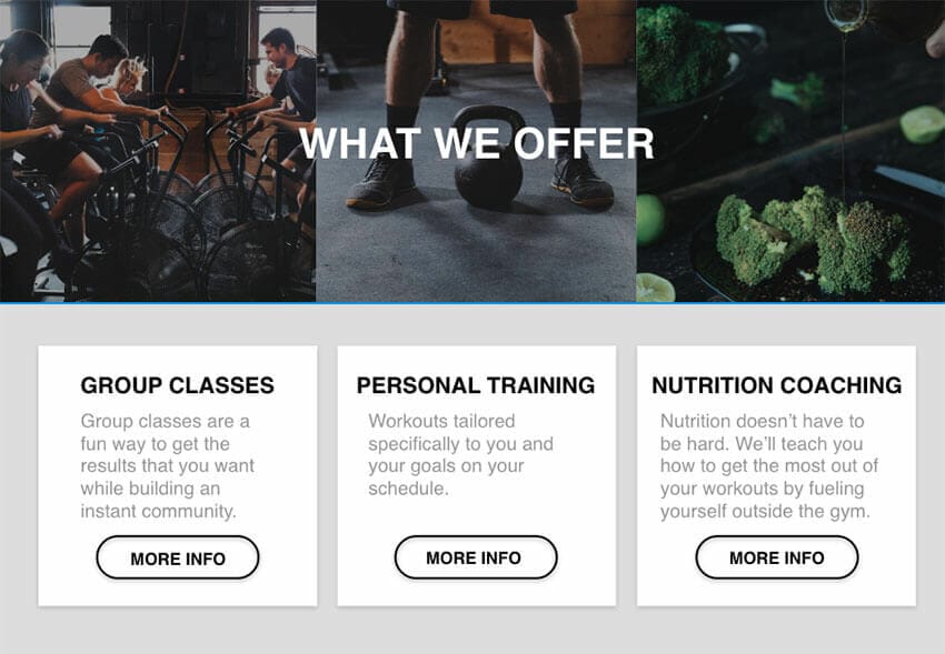
Prominent Workout Posts
CrossFit.com set the tone for gym websites when Greg Glassman started posting simple but effective workouts on his website. Every day, a new workout was posted—and it was the most prominent aspect of the site. Even today, CrossFit.com still devotes its prime real estate to the workout.
Here’s the thing: No visitor to your site cares about the workout of the day. For most, that elegant WOD is actually a confusing, frightening turn-off.
“I’ve never worked out in my life and now I’m supposed to do 21 bar muscle-ups—whatever those are?”
Get the workout off your main page. Let CrossFit.com offer people free functional fitness. You can post your workouts behind a firewall, in a private member’s group, on platforms like SugarWOD and Wodify, or on a page that’s harder for visitors to find.
Intimidating Images

Back in 2009, CrossFit affiliate sites were hardcore. Lots of skulls and blood and heavy barbells. Everyone who enjoyed that sort of thing has already found a gym, and the people who are trolling the web now don’t want to vomit and bleed.
These people aren’t looking for Fran, Karen, Grace and Isabel. They want to lose weight, gain strength, stay or become healthy, and look good naked.
Don’t scare them away with 300-lb. snatches and hands that look like bloody hamburger. Remember the words of marketing expert Seth Godin when building your gym website: “People like us do things like this.”
Stuff No One Cares About
You’re no doubt proud of your credentials, your community and your programming.
But prospective clients don’t care about any of that. If your main pages are packed with NSCA CSCS, CF-L1, CF-L2, ACSM CPT and other alphabet soups, you’re going to lose your audience fast.
Similarly, your elegant, perfectly designed programming progression won’t make an impression on the Average Joes and Janes who just want to lose weight and don’t care about rate of force development and target heart rates.
Finally, every gym has a great community—but no one joins for that. New people might stay because of community, but they join because a gym website shows how the business solves problems for clients.
What’s a Desktop?

It’s barely worth spending time on this one, but here it is: Make sure your site is optimized for mobile devices.
Industry reports show mobile usage is increasing every year, so you’d be foolish to build a site that looks great on a desktop but forces all kinds of awkward pinching and zooming on a mobile device.
Your gym website must perform well on both laptops/desktops and mobile devices.
The Best Gym Websites: Above-the-Fold Landing Page Essentials
Someone clicks onto your website: Can he or she figure out exactly what you do in 10 seconds?
If the answer is no, you’ve got some work to do.
This, of course, is one of the principles of StoryBrand: State what you do clearly and prominently.
Here’s another critical aspect: Clearly show people what you want them to do.
The pre-scroll portion of your website is the snapshot that either engages or turns off a viewer. You’ve got seconds to make an impression. Here’s exactly what people need to see:
Branding
First, your logo should be on the site—usually at the top or in a prominent location. It shouldn’t be gigantic because real estate is at a premium. But you want people to know who you are.
Further, your site’s overall appearance should reflect your brand. If your colors are blue and white, your site should fit into that scheme. If this isn’t your thing, it might be worth hiring a designer. Again, your site is your 10-second pitch to prospective clients. It has to look good.
Beyond colors and logos, ensure that your media reflects your ideal clients. We’ll go over that in detail below. The short version now: Any images visible above the fold should immediately show what you do and for whom you do it.
Are your ideal clients professionals between 35 and 45? Then don’t feature a tattooed 20-year-old in the photos or videos visitors will see first. Replace with a smiling 40-year-old who’s clearly having a great time working out with an invested, professional coach.
This Above All: A Call to Action

A call to action is more important than anything else on your fitness website.
This is the one thing you want visitors to do. And you must make it very easy for them to do it.
Your call to action must be prominent on your landing page, and it must be repeated regularly throughout the page.
In the affiliate and microgym community, the most powerful call to action—or CTA—is “book an appointment” or “book a No Sweat Intro.” This CTA must be tied to a prominent button that immediately takes people to a screen that captures their info before they book an appointment.
This is like the handshake before the kiss. If you try to acquire contact info through booked appointments only, you’re missing out on people who aren’t quite ready to go that far. (This button—or another identical button—should be visible at all times on the site regardless of scrolling. More on that below.)
Once contact info is acquired, the system must automatically alert staff and feed the info into lead-nurture sequences while forwarding the visitor to an integrated appointment booking system (Acuity is just one example).
This system must be capable of supplying instant confirmations and repeated reminders, and it must alert staff of the appointment and trigger associated text and email campaigns. The system needs to engage the visitor until he or she arrives at the appointment. If the person cancels or does not show up, the system must move the person into reacquisition and lead nurturing sequences.
You must not place a host of scattered CTAs all over your page. You must not use confusing CTAs. And you must not ask someone to “email us to book an appointment.”
The best gym websites are direct. They tell people exactly what to do and how to do it. And they make it very easy for people to act. When a visitor acts, good sites alert staff members and trigger all the systems that nurture the lead from prospect to client.
Scroll for Simple Services
Just below the fold, the best fitness sites present a little more detail about what they do.
Again, people should know what you do instantly upon landing, but more detail isn’t a bad thing. Just be sure to avoid listing 17 different services with three tiers of pricing with discounts when two or three are packaged together on the second Tuesday of every month—you get it. Keep it simple here.
Remember, your goal is not to sell a service. Your goal is to have a visitor book an appointment at which you will sell the best services.
So you don’t need a ton of detail just below the fold. You need simple images and graphics and minimal text. All this should be tied to the problems you solve for your best clients.
Do your 30-minute classes offer effective training for busy professionals? Throw up a picture of a clock and the words: “Fast workouts for busy people.”
Does your nutrition program get people ready for summer? Use a picture of someone your best clients want to look like and the words: “Get results fast with nutrition.”
And so on. This section should be short on words but long on impact. Don’t tell people what you do. Tell them what you’ll do for them.
Showcase Media: Show Yourself Off
Throughout your site, but especially in prominent locations, you’ll need media that does the heavy lifting for you.
While phone pics and grainy videos are just fine on social media, your website is the place for your very best work—or the work of a professional. As they say, you only get one chance to make a first impression. If you’re going to invest in media, this is the place to do it.
Let’s be clear: If you can’t produce good photos and videos, you need to license material or pay someone to produce it for you. The benefit of licensing: You can find high-quality stock images fast and at a reasonable price. The benefit of paying a pro: The photos/videos will show your space and your people.
Whatever you do, do not use photos you don’t own. That means nothing you pulled from the internet and no pictures of famous people.
Overall, your media must be bright, well lit and in focus. If it’s a video, the audio must be crisp and clear. The people you showcase should appeal to your best clients. The best policy here: Show friendly, smiling, happy people who look fit and attractive. But don’t use supermodels or extremely fit people. We want “aspirational characters”—people who inspire others but don’t intimidate.
Similarly, stick to movements that aren’t scary. Few people are going to book appointments to learn a squat snatch, which looks terrifying to the uninitiated. But a rowing machine and a smiling coach? A squat with a medicine ball? Jump rope? All those are engaging for people who are just testing the waters.
If you can’t figure out what photos and videos to use, ask some newer clients to review the options and help you make selections. Your new clients were visitors to your site a short time ago and can give you incredible insight.
Secondary CTA: The Other Option

While your goal is to drive people to your main CTA, some people won’t be ready for it. That’s where the secondary CTA comes in.
If an info-capture screen before appointment booking is the handshake before the kiss, the secondary CTA is the hug.
A secondary CTA should definitely not be more prominent than the main CTA, but it should still appear after someone spends some time on the site, either scrolling to find it in a module or as a pop-up triggered by time on page or some other behavior.
The secondary CTA must be attached to some means of obtaining contact info. For example, you could offer a PDF bribe or “lead magnet” in exchange for contact into. Or you could use a quiz that provides valuable insight. Or you could have people enter their contact info to see your pricing.
The point is that you must offer something of value to your target market in exchange for their contact info. As above, when someone enters contact info, the promised resource must be delivered, and associated lead-nurturing campaigns should be triggered.
If you’re giving away a PDF package or something similar, the resource likely doesn’t have to be a 100-page “ultimate guide.” But it should be a branded, high-quality resource that helps your visitor solve a problem. Of course, the PDF should contain your primary CTA so that a reader can click it, trigger automations and book an appointment to see you.
“People Like Us”

Your program works. You know how to use diet and exercise to get results for clients. But let your clients say that—loudly.
Social proof influences people to take actions, and it’s very powerful.
A visitor to your site might not be motivated to act when he or she sees a picture of the owner and a guarantee of success.
“That’s the owner. Of course the owner will say the program works.”
But what if that same visitor sees a kindred spirit? Say, another forty-something accountant who says, “This gym helped me lose 20 pounds in 2 months!” That will have a powerful effect.
“This program worked for her. It can work for me, too!”
Social proof feels more genuine than words from employees or owners—even if those words are absolutely true and backed by data. To some, a visit to a website is like stepping into a car dealership, and many people are instantly suspicious of salespeople. Testimonial content bridges the gap. It’s the friend who says, “This salesperson won’t rip you off. You can trust this business.”
Testimonials influence strangers, and they’re even more powerful if the visitor recognizes the person on your site. That doesn’t always happen, but it’s certainly not uncommon in the local gym market. It’s not hard to see how that experience has an even greater effect on a visitor. “My friend trains here? I’m in, too!”
Social proof can be sprinkled throughout the below-the-fold section of the site or it can be placed in denser blocks—perhaps several of them broken up by other elements. Either approach will work, and your site design should influence your decision. You can use simple quotes, photos and quotes, or videos—whatever media you have that fits the space.
So how much social proof do you need? You can certainly go too far, but in general, more is better than less. Ten smiling faces and variations of “this place is amazing!” carry a lot of weight, especially if you’ve got a group of clients who all relate to the people you want to attract.
Social proof can be acquired in many ways: Comb through online reviews, interview your clients, send out surveys to your members, and so on. Whenever a current client says something that might influence others, ask if you can use the quote on your site.
Similarly, variations in social proof are helpful: Some quotes should reference friendly staff, others should talk about goals accomplished, and others should talk about the ease of starting a new program. And so on. Taken together, your social proof should confront common objectives and help prospective clients make the decision to click your CTA button.
Remember this above all: Social proof is a powerful force. Use it liberally on your site.
A Little More Info
If visitors make it further down the site, you can assume they’re interested or looking for something. They haven’t left and they’re still scrolling.
This is a prime spot to offer some additional information about products and services. Again, don’t get into the weeds and spout off about the finer points of macro tracking. Just add some depth to information you’ve already presented above and establish your expertise.
For example, if you highlighted “fast workouts for busy people” earlier, you might add detail like this: “Short on time? Our classes can help you build strength and lose weight. You only need 30 minutes three times a week!”
If you said “get results fast with nutrition” earlier, try this: “Our nutrition program works because we teach you exactly how to create healthy habits that help people lose weight and drop fat.”
Great media can do a lot of heavy lifting here by showcasing your facility, your classes, your staff, your members and the results you provide.
This section is all about “pulling the thread” and tossing out more detail on how you can help prospective clients. Just as you did above, focus on what visitors are looking for. They aren’t looking for “a detailed macro-tracking system.” They want “to look hot in swimwear.”
Other Pages
Great modern websites are designed to push clients toward actions, not to allow them to wander aimlessly and become confused. For that reason, many sites now lack the once-standard navigation bar that offered visitors a host of choices when they entered the site.
You want people to make one of two choices: Click the CTA button or scroll until they see something that makes them click the CTA button.
But you do need other elements to your site in case visitors want more info. These pages should be available to visitors after they see what you want to show them: Place links in the footer of the website.
Similarly, other pages can help with member retention, and content is important for generating web traffic and time on your site. Social media and private members groups can be used to direct people to these pages if they aren’t immediately obvious to visitors.
So what other pages are essential?
Likely a blog. This is where you establish expertise, answer common questions, offer advice, talk about your philosophy and so on. A good blog helps search engines direct people with questions to your answers, it educates, it adds value and increases retention, and it makes your site “stickier” through lower bounce rates.
A staff page is also a good idea. Visitors often want to see the trainers they might work with or find out more about the facility and its staff. On that page you might also educate visitors about your vision, mission and history.
Or you might feature the vision/mission elements as part of a page with success stories from members. A “member stories” page is a great way to showcase longer social proof for people who want to see more than a short quote before making a decision. If you’ve placed an “I love it here!” quote on your front page, your stories page is where a current client can explain why in 500 words.
Pricing pages? That’s an article unto itself. The short answer: Some established gyms use pricing pages to qualify clients and even drive sales, and other gyms do not need these pages at all. It depends on your business. For more on this topic, read this article: Should you post your prices on your website by Chris Cooper of Two-Brain Business. Whatever you decide, remember that your goal is to have a client book an appointment to talk about a service package. You don’t want to confuse him or her with 50 different options.
A cancellation page is also a good idea if you do it right. A solid cancellation page will actually prevent cancellations by reminding members of all the things they’ll miss out on. But if members do cancel, that page will require them to fill out a form that ensures they’re added to a re-engagement sequence. This lengthy campaign ensures the business stays in touch with old members, and its goal is to get them to come back. The campaign should start automatically as soon as a cancellation occurs.
You can certainly add more sections to your site, such as movement demos, photo galleries and so on. If you do so, you want to ensure that everything random visitors can access will motivate them to book an appointment. If it doesn’t, make sure the sections are accessible to current clients but not available to distract guests.
Creating Gym Websites: Your Options

The best gym and fitness websites are precisely designed platforms that instantly define the business and motivate visitors to a single action—immediately or by presenting carefully selected information to scrollers.
We’ve laid out all the essential elements above so you know exactly what’s needed.
You have a few options for making it happen: You can build a site yourself if you have the time and skills. Or you can pay a design company $5,000 or more for a custom build that will likely still require costly outside services, such as a landing page builder, calendar software, customer relationship management software, and so on.
A better option: A done-for-you solution from Gym Lead Machine. Our average client saves $4,878 per year in service and software fees.
We realize most business owners aren’t web designers, and we believe traditional web design is overpriced and short on the functionality gym owners actually require—design, marketing automation, analytics, tracking, and so on.
We created a solution that handles everything a gym owner needs without a huge up-front investment and bunch of third-party subscriptions. For a demo of a Gym Lead Machine site that contains all the elements essential for a gym business, click here.


