
Picture this: You’ve invested time and effort into creating an amazing gym website. Sleek design, captivating images, and all the essential information laid out. You gain web traffic, but there’s a catch—these visitors aren’t progressing further into your lead funnel. Why?
It’s your call to action (CTA). Even with an impressive website, visitors need clear direction on what to do next. Without a compelling CTA, they may admire your aesthetics and move on. But with the right words, you can help drive engagement, conversions, and desired behaviors from your target market.
We’re here to guide you on creating a CTA that doesn’t just exist but truly gets you more leads and turns them into paying clients.
Let’s design that perfect CTA. Shall we?
What is a Call to Action?
A call to action (CTA) is a clear prompt that tells your audience exactly what step you’d like them to take next. Often found in marketing, it directs people towards a specific action or goal.
You’ll typically see CTAs as clickable buttons. Not only are they used on gym websites, but also in social media posts, emails, blog posts, and paid ads.
Let’s look at 6 examples of CTAs from various Kilo customers:
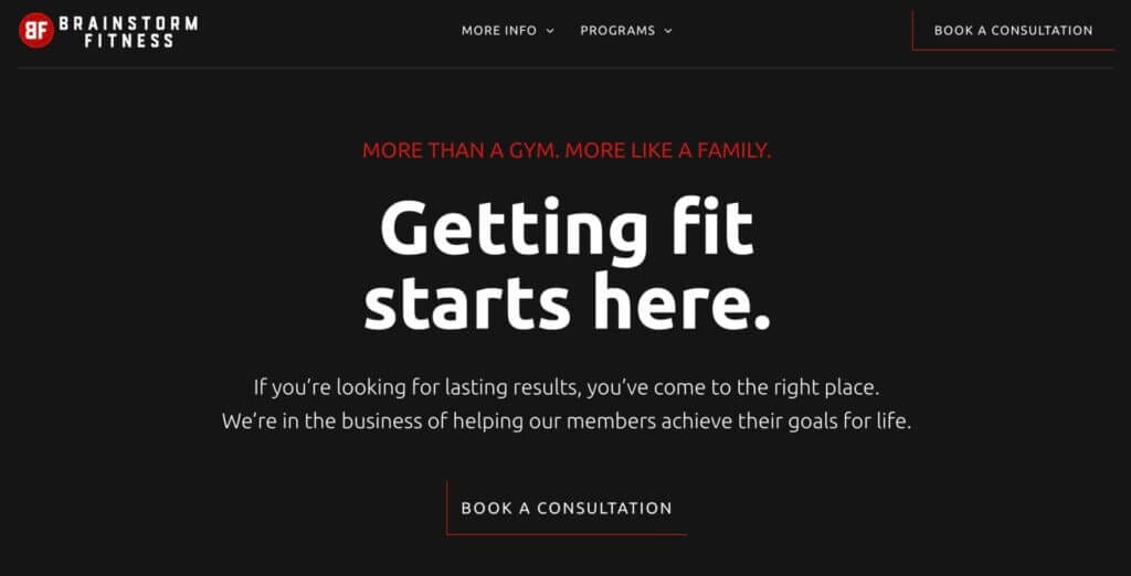
GYM 1: Book a Consultation
GYM 2: Book a Free Game Plan Session

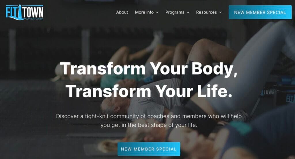
GYM 3: New Member Special
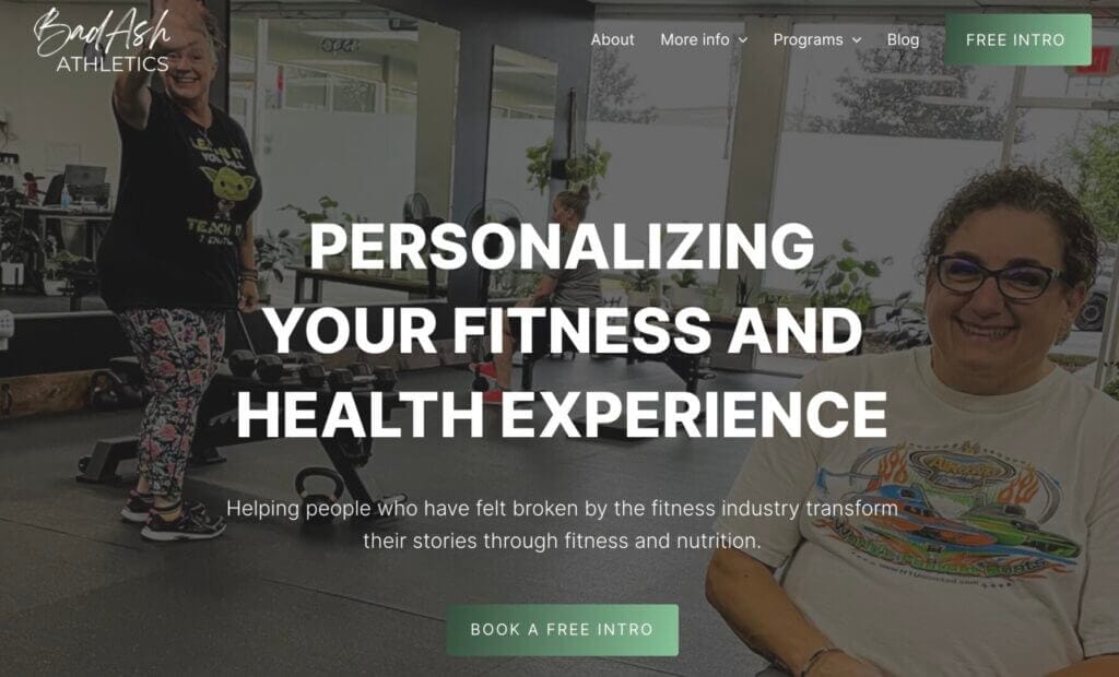
GYM 4: Book a Free Intro
GYM 5: Book a Discovery Call

GYM 6: Book a Free No Sweat Intro Here

Did you notice a common pattern among these CTAs? Each one seems to encourage a click and prompt action.
There’s no shortage of CTAs you can use, but the truth is, some are more effective than others. The best ones resonate with visitors, creating an irresistible urge to see what’s next.
What Makes a CTA Click-Worthy?
The most effective CTAs often share key characteristics that consistently drive engagement and conversions.
A compelling CTA:
- Stands out prominently on the page
- Is simple and concise, making it easy to understand
- Uses action phrases such as “Sign Up Today” or “Join Now”
- Is relevant to the content and offers around it
- Creates a sense of urgency like “Only a Few Spots Left”
- Communicates a benefit or reason for visitors to take action
- Is well-positioned where visitors can easily see it
With these characteristics in mind, let’s move on to how you can build a strong CTA.
Related: Crafting a Clear CTA for Your Gym
How to Write a Powerful CTA for Your Gym Website
There’s lots to consider when creating CTAs. We’ve compiled 8 tips to enhance your CTAs, helping you capture more leads and transform them into paying clients.
1. Be Clear and Direct
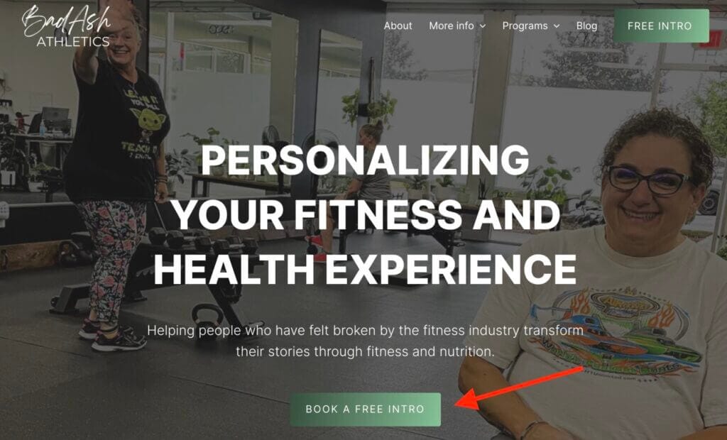
Think about the first thing visitors see on your website: the hero section (i.e., your home page). This area quickly conveys who you are and how you can benefit them. A compelling hero section captures attention and encourages visitors to explore your website further.
Typically, a well-designed hero section includes 5 key elements: imagery, a text block, CTA buttons, your logo, and a menu.
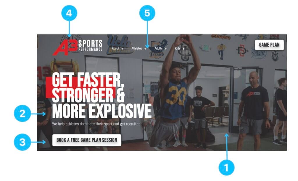
Take a look at our example above. The image offers a glimpse into the gym’s atmosphere. The text pairs perfectly, reinforcing the gym’s appeal. And right there, the CTA button invites you to “Book a Free Game Plan Session.” It’s enticing and easy to understand, right?
Your CTA should be just as clear. Phrases like “Schedule Your Free Intro” or “Book a Discovery Call” leave no room for confusion—they tell visitors exactly what to do. For that reason, it’s best to avoid using vague phrases like “Free Intro” or “Learn More.”
2. Keep it Simple
Too many words on your CTA button can be overwhelming and may deter visitors from clicking. The button should clearly indicate what will happen when they click it.
Take Gym 4’s button as an example. It says, “Book a Free Intro.” It’s simple, and we know what to expect.
When we click it, a form pops up and asks for just a few details — name, email, and phone number. It’s quick and easy to complete.
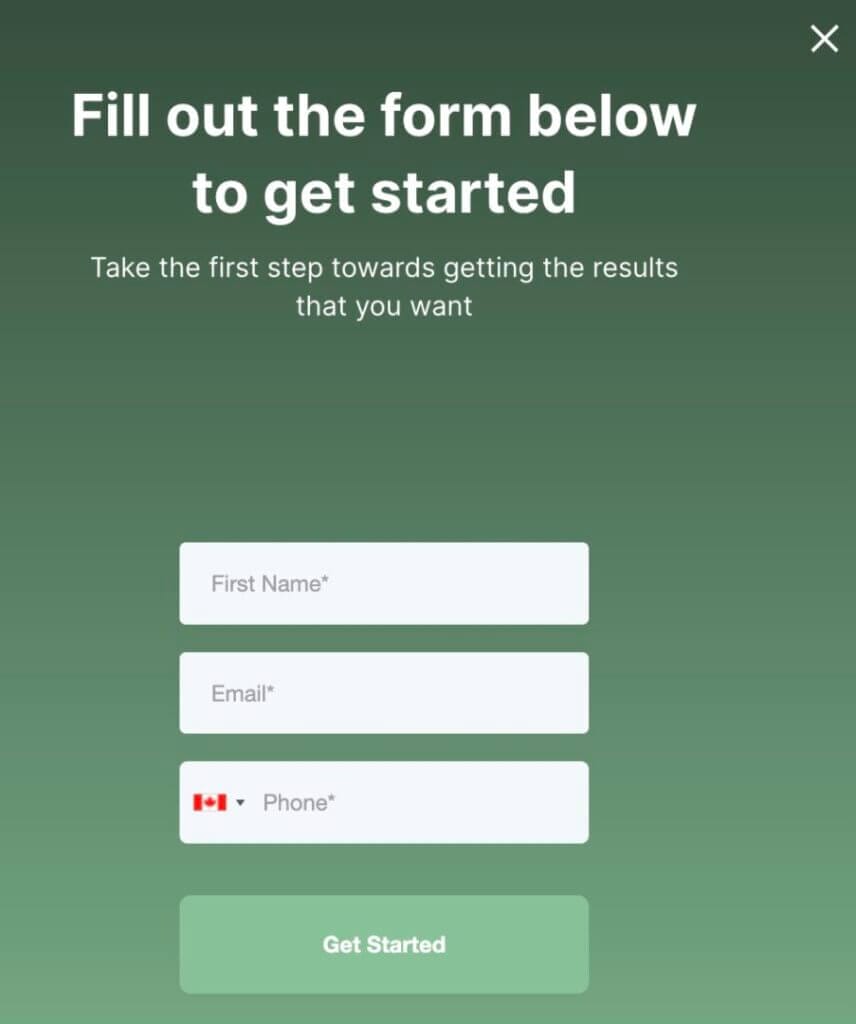
By keeping your CTA button and fields simple, your visitors are more likely to click and engage.
3. Promise Value with Your CTA
Your CTA isn’t just a button or phrase—it’s a promise of value. When visitors see it, they should think, “This is worth my time.” That value can be spelled out right on the button or in the copy surrounding it, as we’ve seen with our examples above.
4. Use Persuasive Copy
The wording on your CTA and its surrounding area are crucial for grabbing attention. While short and direct CTAs are key, the copy on your text block should build the excitement.
To make your CTA more enticing, phrase it positively. Rather than saying “First class is free,” spice it up with “Join us for a free class!” These little tweaks can create a sense of value and push visitors to act.
Remember, adding a sense of urgency can make a difference. A phrase like “Claim your free session—limited availability!” can provide that extra nudge visitors need to click that button.
5. Minimize Investment Risks
A well-crafted CTA doesn’t ask too much from your visitors. It’s often a simple request that’s quick and low risk.
For instance, asking your visitors to “Join Our Newsletter for Expert Tips” after reading a blog post is an easy commitment. It’s free for them but paves the way for you to build trust and nurture them over time.
6. Ensure the CTA Button Catches the Eye
Most site visitors quickly skim webpages, so your CTA needs to be easy to find and catch their eye instantly.
Here are some tips to ensure your CTA stands out:
- Amplify its presence: The size of your CTA button should be slightly larger than other other elements on the page, but it shouldn’t overwhelm the overall design.
- Use contrasting colors: Opt for colours that pop against the background, drawing direct attention to your CTA.
- Minimize nearby distractions: Make sure other flashy elements don’t compete with or overshadow your CTA.
Following these guidelines will ensure that even the quickest skimmers won’t miss your CTA.
7. Position Strategically
Think about how visitors navigate your site. Some might be ready to act right away, while others prefer to browse through your content first.
To cater to both, it’s important to position your CTAs thoughtfully. Place them in spots where taking a next step feels natural and logical to your audience. Key areas include the hero section for immediate engagement and the top menu for easy accessibility.
You can also insert CTAs either within or at the end of your blogs to capture readers at peak interest, as demonstrated by one of our Kilo customers:

8. Tweak for Success
Every gym is different, with its own unique clientele and offerings. That means there’s no one-size-fits-all approach when it comes to CTAs.
You understand your clients best. To create a CTA that truly connects with them, be willing to experiment. This could mean adjusting your wording or rethinking button placements. Track the changes to see what drives the best results.
Remember, just because a particular CTA is effective today doesn’t mean it will be in the future. As your audience’s needs and preferences change, so should your CTAs. Be ready to tailor your approach for continued success.
Drive Engagement and Conversions Through Powerful CTAs
Your gym’s website might look great, but it’s the CTAs that direct your visitors to take the next step towards becoming your clients.
Remember, an effective CTA isn’t just about where you put it or how it looks; it’s about resonating with your visitors, offering value, and prompting action. It needs to be clear, welcoming, and easy to find.
As your gym grows and changes over time, your CTAs should too. Keep refining them to ensure they’re delivering the best results for your fitness business.
If you’re just starting out or looking to optimize your CTAs, use our insights. And if you need help making your website look even better to boost conversions, chat with our team at Kilo. We’re here to make your life as a gym owner easier.


