
Your gym website is one of your most powerful marketing tools. It’s often the first thing potential members see, and with over 60% of consumers choosing a gym based on its online presence, a well-designed website isn’t just a nice-to-have—it’s essential for attracting new members and growing your gym.
📖 Read more: Our Guide to Creating the Best Gym Website Design
This guide simplifies the process by showcasing top design examples and covering:
- Why your website is key to gym member growth
- The must-have elements of a great design
- Best practices to create a high-converting gym website
Ready to create a website that stands out and drives results? Let’s get started. 👇
Why a Well-Designed Website is Key to Growing Your Gym
The way consumers shop has changed forever. The COVID-19 pandemic transformed how people discover and buy goods and services, and the shift toward online shopping keeps growing. According to Tidio, 70% of U.S. consumers shop online, and digital buyers are expected to increase from 268 million in 2022 to 285 million by 2025.
Here are a few more stats:

Your gym website is often the first impression potential members get of your business. It should reflect your brand’s image, values, and niche while providing a clear path for potential members to learn about your gym and sign up. A great website builds trust, shows professionalism, and helps your gym stand out from the competition.
What Makes an Exceptional Gym Website Design?
Every great gym website combines appealing aesthetics, smooth functionality, and a seamless user experience. To stand out from the competition, your gym website needs to excel in all areas.
Brand Identity
Your logo and branding set your gym apart from the competition. Your gym website should prominently feature your logo and incorporate your gym’s colors, fonts, and overall theme throughout the design.
It should also emphasize your gym’s mission and focus, highlighting what makes your gym the better choice—whether it’s state-of-the-art equipment, specialized classes, or a strong sense of community.
Visual Appeal
High-quality images, graphics, and videos elevate the user experience, keeping visitors on your site longer. Their clarity and professionalism also signal value to search engines like Google, increasing your chances of ranking higher in search results.

Easy Navigation and Mobile Friendly
A great gym website makes it easy for visitors to find information and sign up for memberships or classes effortlessly. It should deliver a seamless user experience across all devices—phones, tablets, and laptops. Fast load times are also crucial to keeping visitors engaged and reducing bounce rates.
Search Engine Optimization
To maximize your website’s success, it’s essential to strengthen its design with search engine optimization (SEO). SEO helps your site rank higher, ensuring it reaches potential members searching for gyms in your area.
📖 Read more: All You Need to Know to Boost Your Gym’s Web Traffic
The 20 Best Gym Website Designs
These gym website designs are great examples to inspire your own. They showcase the best practices in the fitness industry, helping you create a website that attracts and converts more members.
1. Gymbox

The Gymbox website is designed to captivate visitors with its bold colors, high-contrast panels, and counter-culture graphics. From the homepage to the landing pages, every element reinforces the gym’s unique brand identity through campy visuals and entertaining content.
Additionally, the website is highly responsive, with fast-loading videos and images that enhance to user experience. These design features perfectly align with Gymbox’s focus on delivering high-intensity, thrilling workouts for people who want an inspiring and energizing gym environment.
2. Orangetheory Fitness

Another example of a bold and energetic design is the Orangetheory Fitness website. The site maximizes its space to highlight its motivational fitness philosophy and strong brand identity. Despite the elaborate messaging, it maintains a user- and mobile-friendly design. Visitors are consistently guided with clear pathways to find a location, explore membership options, or access class information.
3. Above the Barr
https://abovethebarrpt.com/ – A Kilo gym website

Above the Barr stands out with its vibrant color palette, which highlights its brand in an upbeat and visually appealing way. The site incorporates descriptive, vivid images that reinforce the gym’s identity, and its logo serves as an excellent representation of the brand. The color scheme and imagery also display beautifully on mobile devices, ensuring a seamless user experience.
As with all Kilo gym websites, Above the Barr’s design features:
- Mobile, desktop, and tablet responsiveness
- A selection of 30+ pre-built pages
- Premium high-speed hosting
- Facebook Pixel installation for tracking and analytics
4. GoodLife Fitness
https://www.goodlifefitness.com

If you prefer a polished, professional look, the GoodLife Fitness website is a great example. Its homepage greets visitors with a rotating banner featuring high-quality images and videos showcasing the gym’s welcoming environment, engaged members, and dynamic exercise classes.
The site’s layout ensures smooth navigation to membership plans, class schedules, and the membership sign-up page. It also reinforces brand identity through fitness-focused content and cohesive color themes.
5. StrongHer
https://strongherllc.com/ – A Kilo gym website

The StrongHer website exemplifies an aesthetically feminine approach to website design. Its homepage uses thoughtful colors, images, and layout to resonate with the gym’s target audience. Clear pathways guide visitors to book a free intro, explore membership plans, and read members’ success stories.
The bottom half of the homepage features precise graphic panels with quick links to StrongHer’s core programs. Additionally, the mobile-friendly design effectively conveys the brand identity, reinforces the marketing message, and ensures visitors make the most of their time on the site.
6. Tribe London
https://tribe.london/ – A Kilo gym website

The Tribe London Website uses vivid colors and modern fonts to captivate potential members. Updated images and content consistently reinforce the gym’s brand identity and marketing message.
The homepage features a series of clickable panels, providing easy access to key information, including free intros, program details, membership plans, member success stories, and engaging fitness-related content.
7. Equinox

Normally, Equinox’s website exudes sophistication and luxury, featuring gallery-style images and video clips that showcase the gym’s upscale environment. If your gym targets an affluent audience, this site is an excellent example to emulate for projecting a premium brand image.
In addition to stunning visuals, the website offers smooth navigation to classes, membership options, and personal training services. It also highlights Equinox’s specialized programs and exclusive offerings.
8. Studio Salcombe
https://thestudiosalcombe.com/ – A Kilo gym website

Studio Salcombe’s website is dominated by strong, impactful images that effectively convey the gym’s brand identity and appeal to its target audience. The design promotes easy navigation, seamless mobile usability, and overall accessibility.
Understated colors and soft-contrast images draw attention to the people and events featured in each subject panel. At the bottom of the homepage, the site creatively displays its logo and contact information, setting it apart from the competition.
9. Fit4Mom

Fit4Mom’s website is an excellent example of a specialty gym design tailored to a specific audience. Designed to attract mothers seeking a safe and supportive fitness environment, the site prominently features images of moms working out with their babies nearby. It also highlights the diverse workout programs Fit4Mom offers.
The overall design captures the essence of the gym’s welcoming community, creating a space that resonates with its target audience.
10. ErgoFit
https://goergofit.com/ – A Kilo gym website

ErgoFit’s website stands out for its consistent branding across all images, creating a cohesive and professional look. The homepage features an inviting photo of the front lobby, perfectly reflecting ErgoFit’s upscale image. Other images showcase the diversity of their programs, reinforcing the gym’s appeal.
The straightforward layout ensures effortless mobile browsing and provides quick access to essential calls-to-action, including classes, programs, and other key content.
11. Rail Stop Fitness
https://railstopfitness.com/ – A Kilo gym website

Color combinations are a powerful tool for showcasing your brand, and Rail Stop Fitness’s website is a great example of how a cohesive color theme can set the tone for your marketing message.
In addition to embodying all the essential qualities of a well-designed website, the custom copy and images throughout the site effectively reinforce the gym’s focus on helping members achieve their goals.
12. Mark Fisher Fitness (MFF)
https://markfisherfitness.com/ – A Kilo gym website

Mark Fisher Fitness’s (MFF) website sets the bar for using bold colors to define its brand and appeal to its target audience. The vibrant color scheme draws visitors’ attention to MFF’s offerings and calls-to-action, while perfectly capturing the gym’s quirky, fun, and eclectic vibe.
13. The Floor PDX
https://thefloorpdx.com/ – A Kilo gym website

If your gym has a nontraditional setup, the Floor PDX website is an excellent example to follow. Its layout features a subdued and professional design, complemented by descriptive images and informative content. As a therapeutic facility, the site is thoughtfully designed to accommodate first-timers, ensuring a welcoming and accessible experience. The gym’s distinctive logo further reinforces its unique identity.
14. Fitness Inc Training Studios
https://trainatfits.com/ – A Kilo gym website

The Fitness Inc. Training Studios website leverages top-tier design resources from Kilo’s design library. It excels at showcasing what it’s like to work out at the facility, offering visitors an engaging glimpse into the gym experience. The straightforward homepage layout ensures users can quickly access essential information and easily follow prompts to sign up.
15. Calisthenics Amsterdam
https://calisthenicsamsterdam.com/ – A Kilo website

The Calisthenics Amsterdam website showcases the gym’s fun, challenging, and rewarding programs through its engaging design features. Regular updates and strong optimization ensure the site stays fresh, compelling, and user-friendly.
16. Barry’s

If you’re looking for a sleek, modern, and energetic website design, Barry’s website is a great example to explore. The homepage features glossy images of members working out and enjoying the facilities, paired with a bold, straightforward call to action.
Barry’s also incorporates videos and photos to showcase the intensity and energy of its workout programs. The top banner rotates through images of various gym locations and partnerships, providing an engaging visual experience for visitors.
17. Planet Fitness

Since Planet Fitness is a well-known brand, many visitors already associate it with a fun and inclusive image. The homepage reinforces this perception with playful cartoony visuals and humorous headers. This approachable design effectively guides users to pro-conversion features like the “Join Now” button and membership plans.
For gyms with multiple locations, Planet Fitness’s “Find a Club” feature is worth noting. It allows visitors to easily browse gym locations and explore their offerings.
18. Crunch Fitness

The Crunch Fitness website uses vibrant imagery and bold colors to appeal to its target audience. Its user-friendly design features colorful scenes of members and trainers during workouts, eye-catching calls-to-action, and intuitive navigation. The dynamic format and energetic color scheme perfectly highlight the brand’s fun, high-energy identity.
19. Anytime Fitness
https://www.anytimefitness.com/

The Anytime Fitness website has a fresh and modern design that reflects the gym’s focus on member experience and accessibility. The clean color scheme grabs attention and encourages engagement. For instance, the homepage header showcases images that reflect the gym’s welcoming community and top-notch facilities.
In addition to its engaging visuals, the site includes key elements of great design, such as simple navigation and clear calls-to-action.
20. The Barre Code
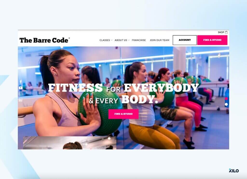
The Barre Code website showcases how crisp, subtle design can leave a strong impression on your target audience while complementing your brand identity. Its minimalist format ensures easy navigation, particularly on mobile devices.
High-quality images highlight the variety of workout regimens offered, adding visual appeal and clarity. Overall, this design stands out for promoting the gym’s brand with elegance and a memorable flair.
Best Practices When Designing a Gym Website

As you finalize your gym website design, keep these best practices in mind:
- Keep it simple: Clarity and simplicity are key. Avoid cluttered designs and prioritize easy navigation to keep potential members engaged.
- Highlight your benefits: Put your gym’s main selling points front and center. Make it clear why visitors should choose you.
- Use professional visuals: High-quality images and videos are essential for showcasing your gym’s strengths and creating a lasting impression.
- Think about SEO: Make sure every part of your website is optimized for search engine optimization to attract more traffic and leads.
Growing Your Gym with the Right Website Design
Your website is your gym’s first impression online. Use these top designs as inspiration to create a site that attracts and converts visitors. Or book a call with our team to set up a high-converting, pre-built Kilo gym website!


